v0.13.0
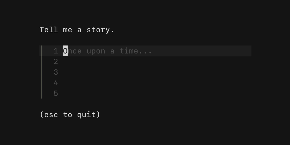
Textarea Bubble
This feature release includes a brand new textarea bubble that you can use to input as many lines of text as your heart desires (or until your computer memory runs out, whichever comes first).
See the example code for a simple example of how to use the textarea in your Bubble Tea applications.
Customization
There are a few ways to customize the text area.
SetHeight(height int): tells the component how many lines of text it should display at once.SetWidth(width int): tells the component how wide the it should be.ShowLineNumbers: whether or not to show line numbers on the left-hand side of a line of text.Prompt: the prompt to display on the left-hand side.EndOfBufferCharacter: the character to display as the line number after the last line to fill the rest of the height. Defaults to~.CharLimit: Prevents users from typing more than a set number of characters.KeyMap: The set of keybindings to navigate and interact with thetextarea.
Styling

The textarea can be customized heavily with Lip Gloss.
FocusedStyles: the styles to be applied while thetextareais focused.BlurredStyles: the styles to be applied while thetextareais focused.
Each of the above properties has the below sub-properties that can be modified.
Base             lipgloss.Style
CursorLine       lipgloss.Style
CursorLineNumber lipgloss.Style
EndOfBuffer      lipgloss.Style
LineNumber       lipgloss.Style
Placeholder      lipgloss.Style
Prompt           lipgloss.Style
Text             lipgloss.Style
See the split editors example for how to style the textarea component.
Read more about it in our examples and docs:
Thoughts? Questions? We love hearing from you. Feel free to reach out on Twitter, The Fediverse, or on Slack.