UITableView Disclosures
In this post I wanted to show how to quickly and easily create and style a custom disclosure button on a UITableView.
By default, if you enable the disclosure button with something like the following code:
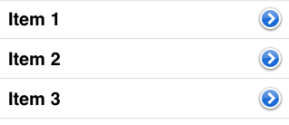
cell.accessoryType = UITableViewCellAccessoryDetailDisclosureButton;You'll get something like this:
Now to create our own version of the disclosure button, in our code where we create the cell, we would do something like this:
UIButton *button = [[UIButton alloc] initWithFrame:CGRectMake(0,0,40,40)];
[button setTitle:@"➤" forState:UIControlStateNormal];
button.styleId = @"disclosure";
cell.accessoryView = button;
A few things to point out in those 4 lines above. One, we're using a special character, ➤, to represent the arrow. This is just a quick and easy way to put a custom graphic in your button -- by just using a text character. Second, and most importantly, note how we set a 'styleId' on the button. This is how Pixate finds your button in order to style it.
Now that we've done this, it's just a matter of adding some CSS to your default.css file (or whatever file you end up using). Here's some styling to make it look at little like the default version of the disclosure button:
table-view #disclosure {
    background-image: linear-gradient(#75a4e6, #2670d8);
    border-radius: 15pt;
    border-width: 2pt;
    border-color: white;
    border-style: solid;
    size: 27pt 27pt;
    font-size: 16pt;
    box-shadow: 1pt 1pt 1pt #333;
}
Now we get this with our newly styled custom disclosure button:

And changing just a few of the CSS properties as follows:
background-color: linear-gradient(red, pink);
border-radius: 5pt;
We can further change how it looks:

Hope you enjoyed this article.
[Published: 2012-12-15]