ggplot is going to be our best friend for this module
Great link to bookmark: ggplot cheatsheet
“Importing” data means loading a file from your computer into your programming environment, then storing it in a variable to make it available to us.
- london air - camden open data
Our preferred data format. CSV is like an Excel spreadsheet, but just plain text:
name,surname,occupation
basile,simon,journalist
mick,jagger,musician
theresa,may,prime minister
R will recognise the structure above and understand that the commas represent columns. It will show the structure above as a table-like representation:
| name | surname | occupation |
| basile | simon | journalist |
| mick | jagger | musician |
| theresa | may | prime minister |
We start by loading in the CSV file containing our data:
library(readr)

df <- read_csv("data/airpollutioneuston.csv")
View(df)install.packages("ggplot2")
install.packages("dplyr")
library(ggplot2)
library(dplyr)The WHO guideline for NO2 pollution is to stay under 40ug/m3 annually.
Did this happen on Euston Road? We load dplyr to get some basic stats back from our dataset very quickly:
library(dplyr)

df %>% summary()
We could also calculate our mean manually with summarise - many handy functions we can use, actually
df %>% summarise(annual_mean = mean(Value))

  annual_mean
        <dbl>
1        82.8

# how many observations do we have?
df %>% summarise(observations = n())

  observations
         <int>
1 365One issue with our dataset: ReadingDateTime column comes out as a string (see df %>% summary() showing character value).
We will need to parse that as a date!
Dates as odd creatures. We parse strings and convert them into dates, but how does the computer know the format of the date?
2018-01-02
2018/02/01
These dates could be identical or different depending on how we parse them.
2018-01-02 parsed with %Y-%m-%d becomes 2nd Jan 2018
2018-01-02 parsed with %Y-%d-%m becomes 1st Feb 2018
We’ll use British standards in this case:
df <- df %>% mutate(Date = as.Date(ReadingDateTime,
                                   format = "%d/%m/%Y")) %>%
  select(Date, Value)

  Date       Value
  <date>     <dbl>
1 2017-01-01  69.9
2 2017-01-02  57.5
3 2017-01-03  91.9
4 2017-01-04 67.9# install.packages("ggplot2")
library(ggplot2)
ggplot(df, aes(x = Date, y = Value)) +
geom_point()
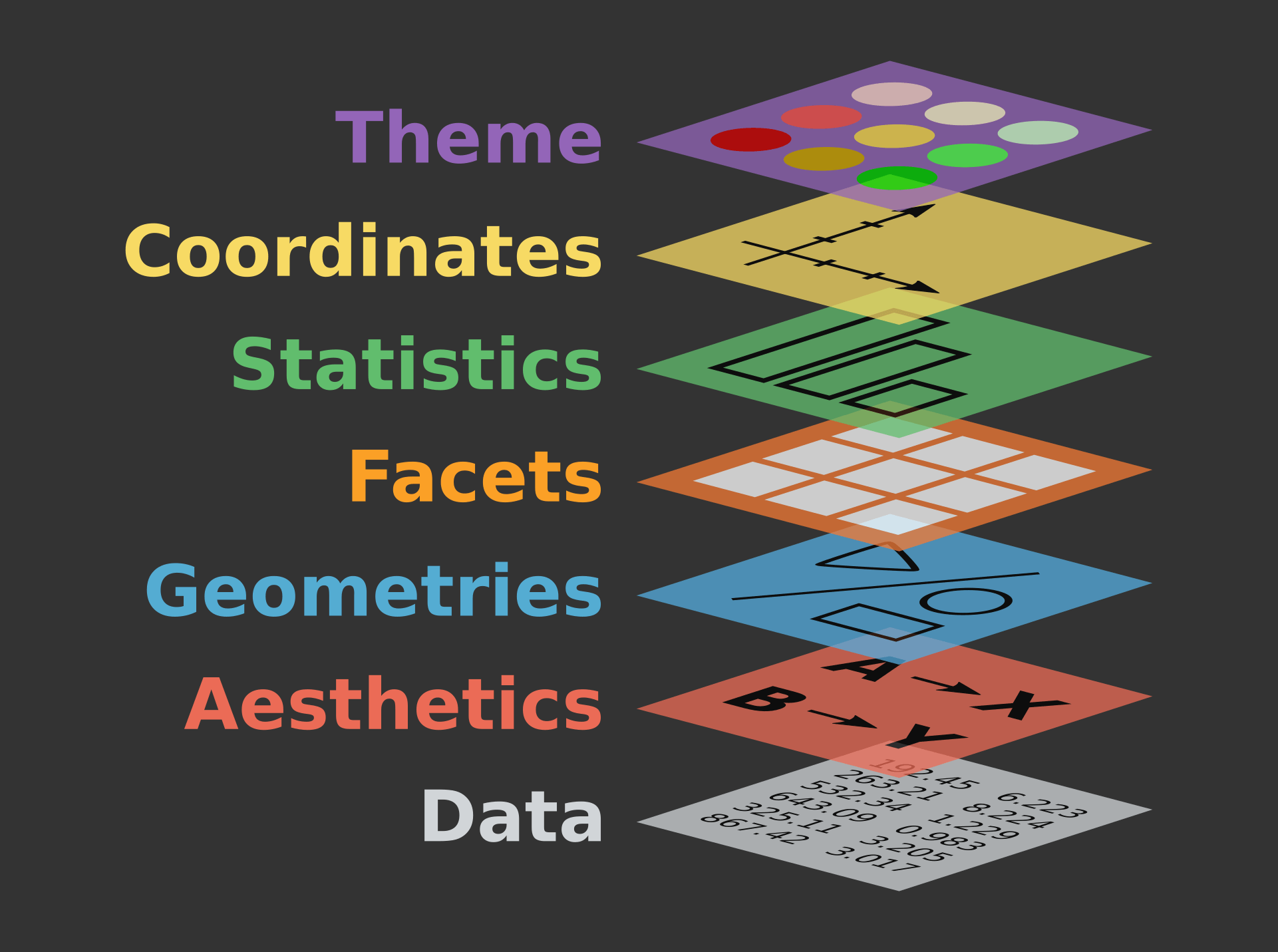
We just used ggplot, the leading R visualisation package, to create a scatterplot. Ggplot is a grammar, ie a chart is composed of several bricks:
- a dataset,
- geometries,
- a coordinate system
alphais opacity- colours are written in hex codes - What to consider when choosing colours
geom_hlineis a new geometry! We can also usegeom_vlinefor a vertical line
ggplot(df, aes(Date, Value), color='#254251') +
  geom_point(alpha = 0.5, color="#254251") +
  geom_hline(yintercept=40) +
  scale_y_continuous(breaks = c(40, 100, 150, 200, 250),
                     labels = c(40, 100, 150, 200, 250))
library(scales)

df$alpha <- rescale(df$Value, to=c(0,1))

ggplot(df, aes(Date, Value), color='#254251') +
  geom_point(alpha = df$alpha, color="#254251") +
  geom_hline(yintercept=40) +
  scale_y_continuous(breaks = c(40, 100, 150, 200, 250),
                     labels = c(40, 100, 150, 200, 250))
We want to calculate a 30-day rolling average. This is super wasy in R: we need rollmean, from the zoo package.
Syntax:
rollmean(data$column, period)#install.packages("zoo")
library(zoo)
df_mean <- df %>%
mutate(mean = rollmean(Value, 30, fill = NA))
ggplot(df_mean, aes(Date, Value), color='#254251') +
geom_hline(yintercept=40) +
geom_point(alpha = df$alpha, color="#254251") +
geom_line(aes(x = Date, y = mean)) +
scale_y_continuous(breaks = c(40, 100, 150, 200, 250),
labels = c(40, 100, 150, 200, 250))
We can also use pipes to avoid mutating our dataset as we go along, like so:
dataframe %>%
  do something on it %>%
  like filtering, adding columns, etc %>%
  then send it to ggplot like so %>%
  ggplot() +
    add geometries, etc
df <- read_csv("data/airpollutioneuston.csv")
df %>% filter(!is.na(Value)) %>%
mutate(Date = as.Date(ReadingDateTime,
format = "%d/%m/%Y"),
mean = rollmean(Value, 30, fill = NA)) %>%
select(Date, Value, mean) %>%
ggplot() +
geom_hline(yintercept = 40) +
geom_point(aes(x = Date, y = Value, alpha = 0.5, color = "steelblue")) +
geom_line(aes(x = Date, y = mean)) +
scale_y_continuous(breaks = c(40, 100, 150, 200, 250),
labels = c(40, 100, 150, 200, 250)) +
ggtitle("Hourly NO2 concentration in Euston road") +
xlab("Date") + ylab("NO2 concentration") + theme(legend.position="none")
https://www.ted.com/talks/hans_rosling_shows_the_best_stats_you_ve_ever_seen
https://www.datacamp.com/community/blog/the-easiest-way-to-learn-ggplot2#gs.QnUNY8Y